Skim mode is on: just the key point of each paragraph. Turn it off to read the full case study.
The stakes: a merchant’s first $500
I lead design for GoDaddy’s in-person selling: the merchant’s journey from activating a device through setup, catalog, payments and checkout, across Smart Terminal devices, the Commerce Mobile apps and the web. I grew the team from 3 to 7 designers.
Every team aims at one bar: $500 in sales in a merchant’s first 60 days. Our analytics team and product partner found that merchants who hit that bar are much more likely to go on to sell the volume they signed up for. It became the activation metric for 2026. Onboarding’s job is to get them there.
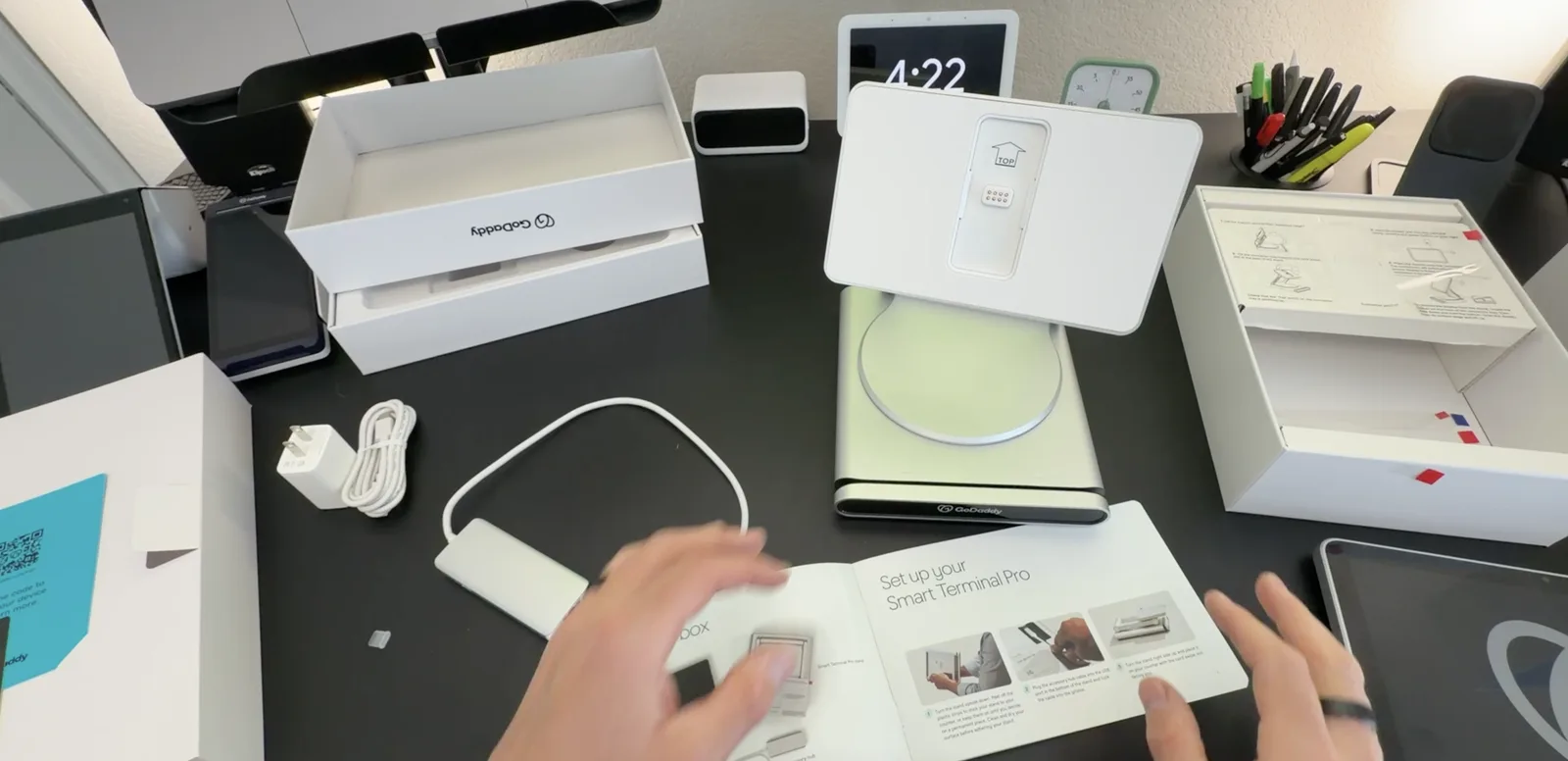
Setup alone took days. My team and I buy every device the way a merchant does: in a private browser, on our own cards, shipped home, so we get exactly what a merchant gets. The out-of-box experience showed me where merchants stall: when setup finished, it left me on a screen with no next step. I documented the quality issues for the teams that owned them. Merchants hit the same walls, and setup was one of the top reasons they called support. Merchants told us they’d lost hours to setup, and some returned accessories.
Why it broke: the product split exactly where the org did
This wasn’t a list of UX bugs. The terminal, the mobile app and the web each had its own product team, backlog and design system. A merchant’s first sale crosses all three. Our help tutorials were organized by app, but a first payment runs through catalog, register and orders. When a designer on my team built one tutorial across all three, it ended up as a register-only version, because no one team owned the whole path.
- 1 Activate the device on Terminal
- 2 Set up the account on Mobile
- 3 Connect accessories on Terminal
- 4 Import the catalog on Web
- 5 Take the first payment on Terminal
- 6 Check the day’s sales on Mobile
- Product and engineering, still organized by device, so seams remain between devices at that layer
- A seam: the merchant crosses into another team’s surface, and no one owns the crossingA handoff: one stage ends and the next begins, with a squad accountable on each side
Everything had shipped fast, which was the right call at the time. But it left no one owning the whole journey, or even looking at it end to end.
The work before the work: one map, one measure
We went to merchants’ stores. In-person research for each major release taught us that most merchants aren’t technical, every store is set up differently, people want instructions written, illustrated or on video, and many bring accessories bought from Amazon, eBay or a previous provider.
I wrote one map of the merchant’s jobs. It built on earlier end-to-end mapping by designers on my team: one North Star job, 12 jobs across the merchant’s lifecycle, and a lens for what had to be excellent versus where we could win. Then I set our 2026 design objectives by journey stage instead of by device, lined up with the commerce objectives, so product and design measured the same stages.
The map became how we work. Both surface guides use it as their job framework, the reading path for new designers starts with it, and in design reviews we ask whether a design would still deliver the job if the screen changed.
The trade-off: keep designers on their devices, or organize around the journey
Device expertise or journey ownership. Keeping each designer on one device meant deep expertise and fast, confident work on familiar hardware, but nobody owned the handoffs between teams, which is exactly where merchants stall. Organizing into journey squads (payments and checkout; catalog, inventory and orders; activation and setup) meant one owner for each merchant job, end to end.
I proposed journey squads and took my team all the way in. I raised the broken handoffs with my manager and proposed organizing around the merchant’s journey. My manager made the org-wide call, and I made the call on how far my team went: all the way. AI was entering our design process at the same time, which lowered the cost of designing on an unfamiliar device and made the bet workable.
It cost us depth. Mobile came down to one designer, and designers took longer than planned to get productive on devices they didn’t know. I owned that ramp-up miss. How we paid it down, and how the team grew through it, is its own case study.
Beyond my team
Partner teams worked from the merchant’s journey too. The packaging team ships our redesigned setup guide in every box, and the team that makes our help videos built them around the steps where merchants were getting stuck.
What we shipped
The team designed and shipped each piece below; I set the direction and made the call when we disagreed.
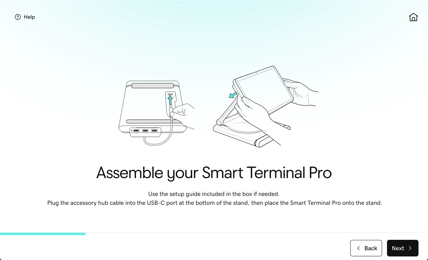
- Out of the box: charging and assembly in first-run setup. The plan was help articles. I pushed back that it was a design flaw, not a documentation gap: people expect a tablet’s USB-C port to charge it, and instructions only help the person who does setup. Merchant feedback backed that up. A designer on my team brought assembly and charging into first-run setup, the steps went on a sticker on the stand, and I reworked the printed guide with our packaging team and tested it with real merchants. It started with the Pro; I took it to the Duo and Flex next, so a reworked guide now ships in every box.
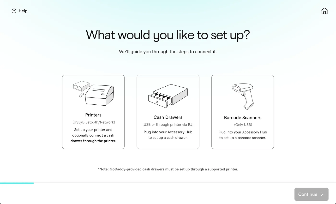
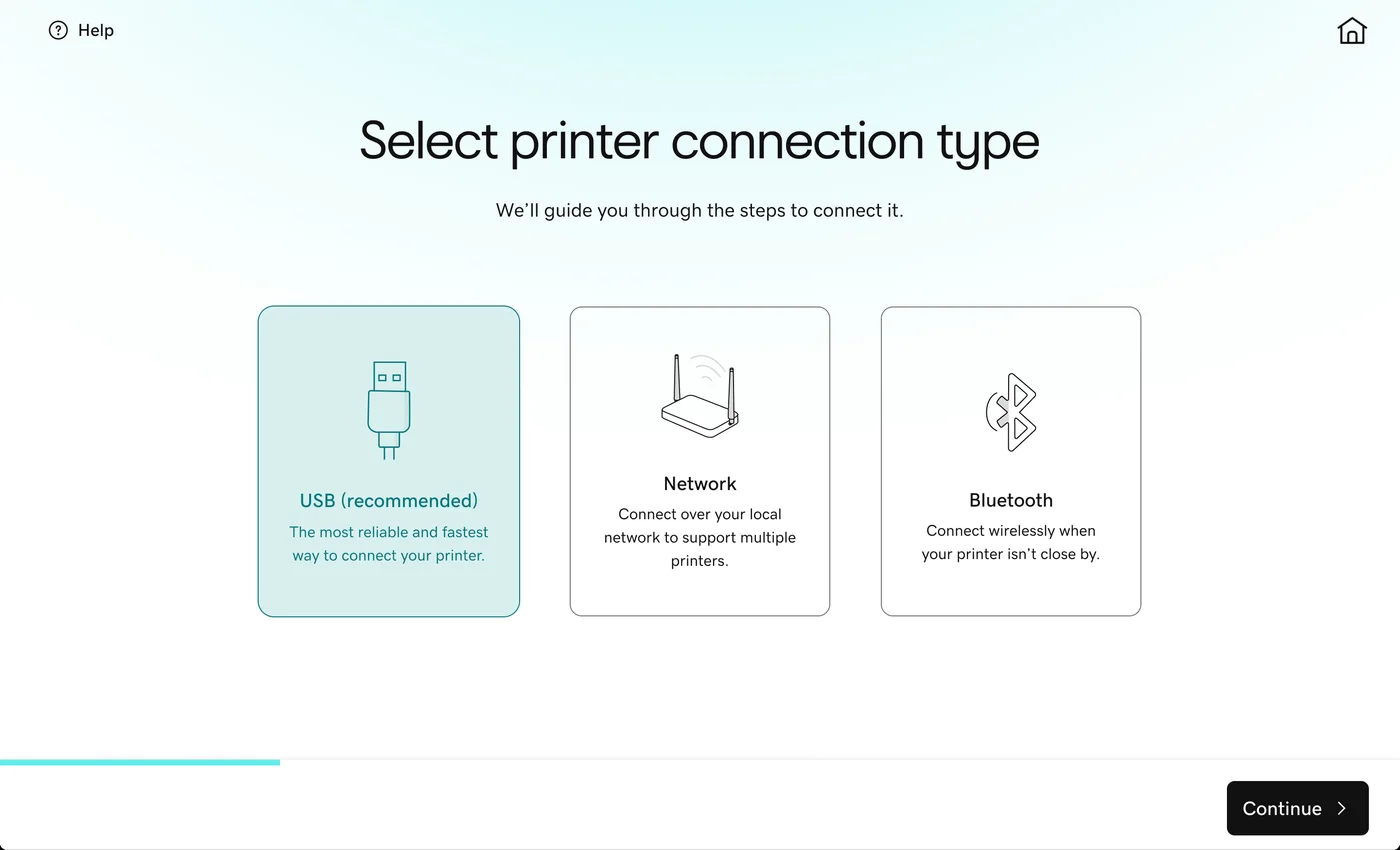
- Accessories Manager, led by the same designer, with illustrations by another. Guided setup for printers, scanners and cash drawers, with ports and cables shown as pictures, because merchants match a plug faster than they recall “USB” or “LAN.” Engineering wanted to pick by connection type only, for the fewest choices. I pushed to keep finding an accessory by model as a fallback, so a merchant who doesn’t know their connection type isn’t stuck. We shipped both. In a July review, accessories connected end to end for the first time in four years.
- Tutorials, redesigned by the designer who illustrated Accessories Manager. They became progressive, so merchants don’t face them all at once, shaped around the kind of merchant and what they’re trying to do, and easy to bring back after dismissing them.
- Catalog bulk import, redesigned by the senior designer who leads the catalog squad. First-try import success roughly doubled.
- A mobile setup wizard my team designed, which walks new merchants through their first setup steps on their phone.
Shipped on Smart Terminal
-
 (opens the full-size image in a new tab)
Accessories Manager
Each accessory gets its own guided setup, with the hardware drawn so merchants recognize it.
-
 (opens the full-size image in a new tab)
Connection type first
With finding an accessory by model kept as a fallback.
-
 (opens the full-size image in a new tab)
Assembly, on the device
Text and illustration side by side, inside first-run setup.
AI on a journey someone owned
I put AI on top of a journey with an owner, and we measured it like any other change. Our voice-led setup agent on the terminal guides a new merchant through setup, because typing on a terminal screen is painful. A designer on my team leads its design; I set the UX direction and made two calls: core setup flows before personalization, and build the agent around the existing web setup wizard, which a partner design team owns, handing web steps off to it by QR code instead of rebuilding them as another setup journey. I made the first $500 its bar.
The first test was inconclusive, and the gap was mine. Merchants who declined the agent also lost the guided tutorials, so they had no help at all. I hadn’t designed the “no” path as carefully as the “yes” path. The next test restores the tutorials as a fallback.
Dashed: the next test, not yet run
Outcomes
- Accessory connections per terminal rose about 20x in 2026. Accessories Manager and direct accessory sales landed together, so the credit is shared.
- Completed accessory setups roughly doubled. Starts more than tripled as less technical merchants arrived through direct sales, so the share finishing fell from about nine in ten to about half. Help-article opens went from about one in ten setups to more than half. That told us it was a guidance problem, not a reliability problem, which is where the AI work aims.
- First-try catalog import success roughly doubled after the bulk import redesign.
- The new mobile setup wizard: 58% of merchants reached first active use with it, against 34% without. It’s an early read on a small test.
- The agent’s first test was inconclusive, with a clear fix for the next one.
- The first $500 itself: it’s too early to read this year’s merchants against it. These are the leading indicators on the way there.
What I’d do differently
I’d make the cost of separate priority lists visible sooner. Design moved to journey squads, but product and engineering kept a priority list for each surface, and nothing showed where those lists competed for the same people. The seams didn’t disappear; they moved to the product layer. Next time I’d put that overlap, and what it really costs, in front of product and engineering early, and push for one priority order before reorganizing design.
What I carry forward: the org chart ships with the product, so I design both. One map of the customer’s jobs and one shared measure come first. Every team’s priorities answer to them before any reorg, and before any AI. When AI does arrive, the old path stays as a fallback.
Figures are rounded or shown as relative change to protect GoDaddy’s confidential data. I’m glad to walk through the details in conversation.
Next case study · GoDaddy Giving a design team an operating model, and room to own it I inherited a team with no shared way of working. I built an operating model, made AI part of how it runs, then gave the team room to own it. Read the case study